Onboarding for new Yango users
YANGO APP
SEPTEMBER 2023
As part of improving the authorization experience for both new and current users, the goal was not only to refresh the UI to align with the Yango design system, but also to fix a number of UX and technical issues.
Key objectives of the redesign:
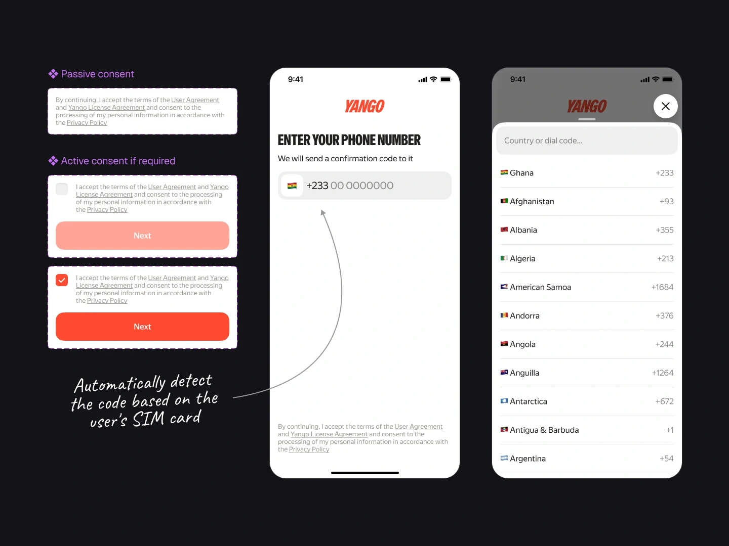
Clearer communication
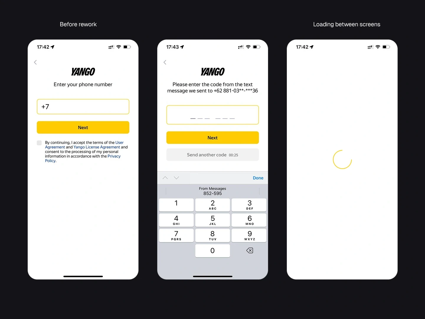
The current onboarding doesn’t clearly explain where or how the authorization code will be delivered. It lacks transparency about available delivery channels (e.g., WhatsApp), and is cluttered with legal links and secondary messages. The new version aims to simplify the screen structure, make user flows more intuitive, and maintain a consistent visual language across all Yango products.
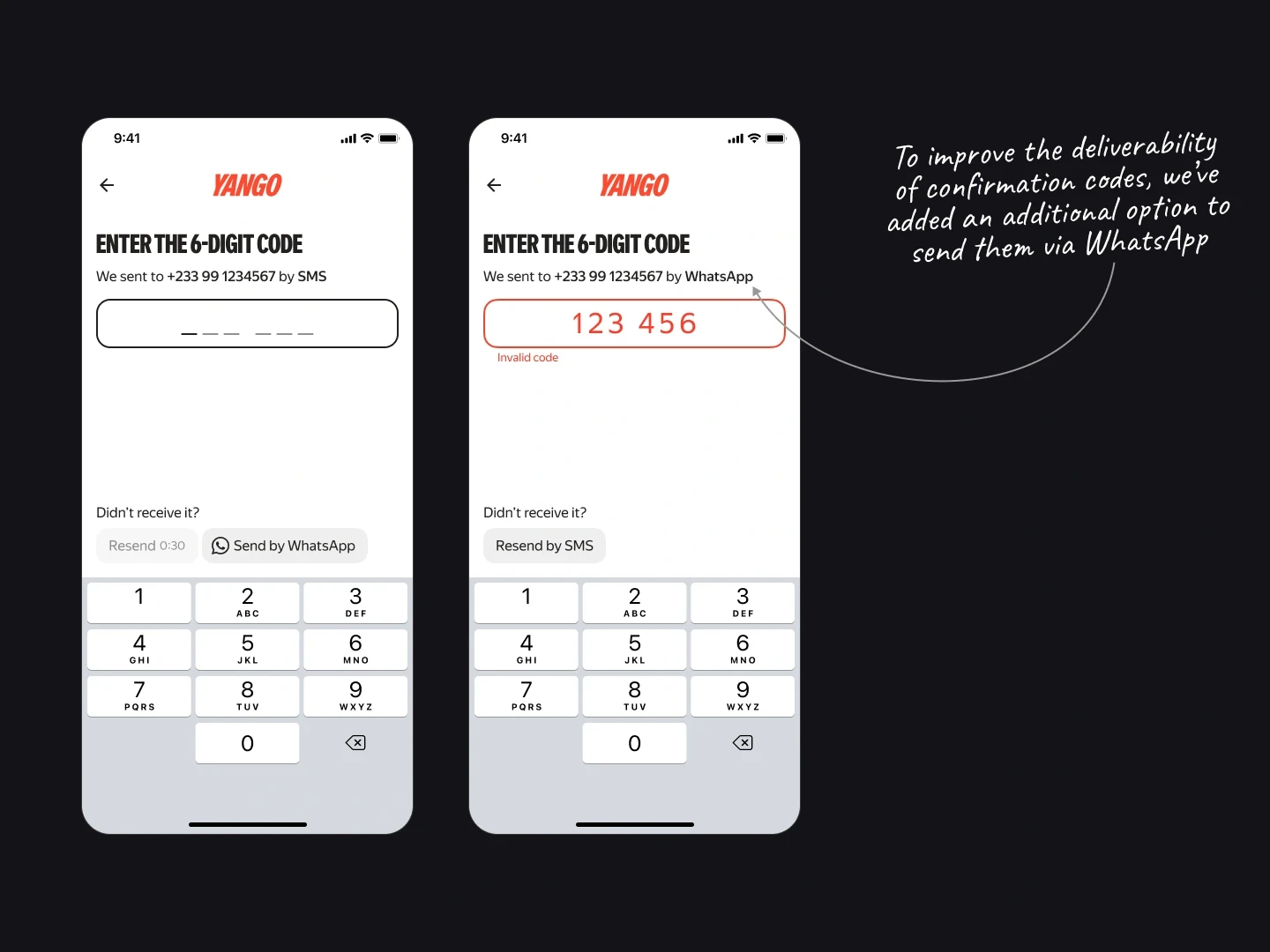
Support for multiple delivery channels of confirmation codes
While SMS is the default method for the code, it is unreliable or unavailable in certain countries. In these cases, WhatsApp is used, but the current design doesn’t reflect this logic. Additionally, there are real-world situations where receiving an SMS is physically impossible (e.g., no SIM card after arriving abroad).
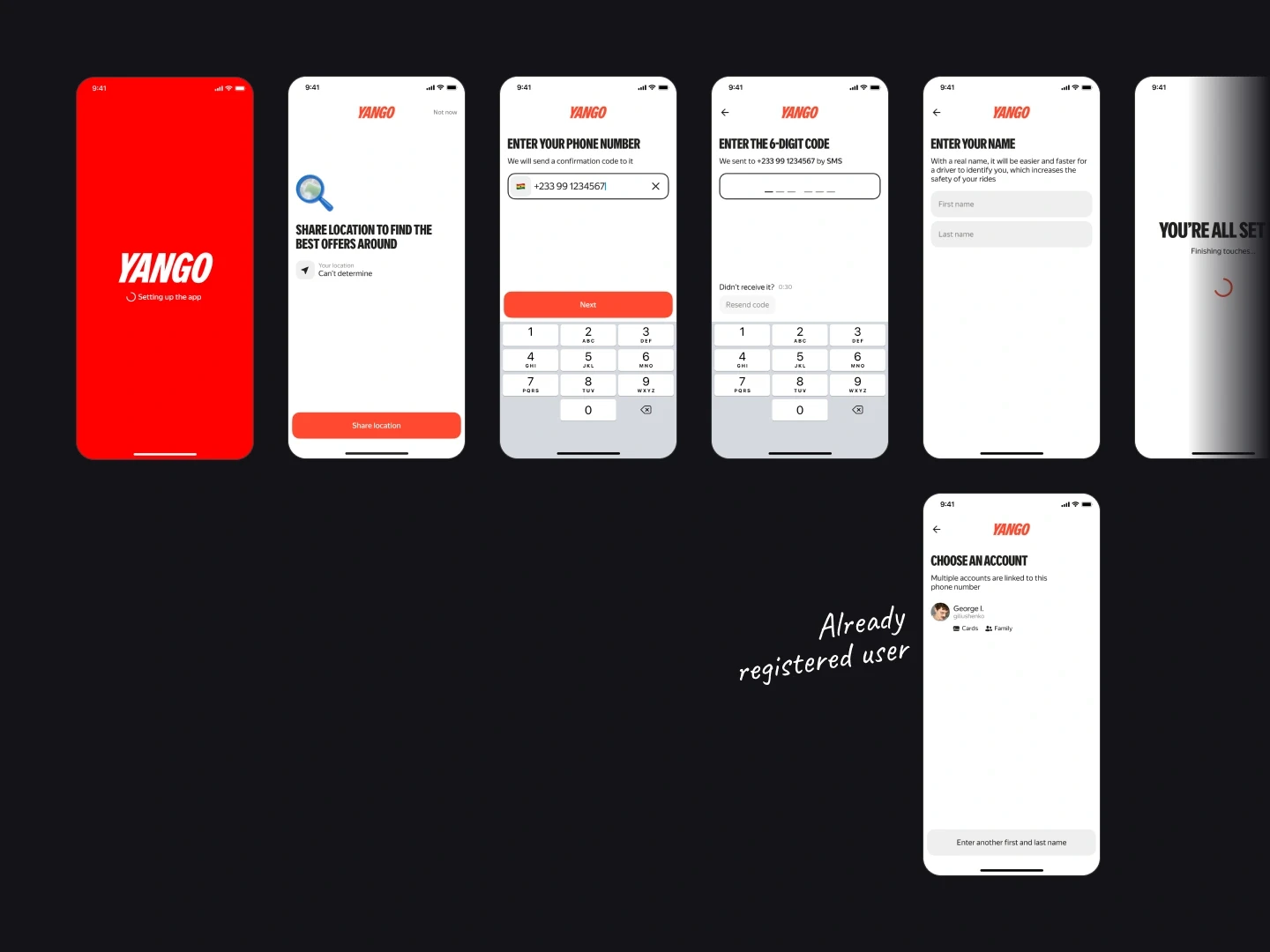
Handling multiple accounts per phone number
Some users may have several accounts linked to the same phone number (via email or other login methods). The interface must support account selection and provide access to all relevant login paths.
This project is more than just a redesign — it's a fundamental rethinking of the onboarding experience, grounded in real user behavior, local context, and technical constraints.
To deliver a more polished first experience with the Yango app, several targeted design decisions were made:
Loading states and transitions were visually integrated into the interface or subtly hidden, helping to reduce visual noise and maintain a seamless flow between steps.
Identified and addressed corner and the most common failure scenarios in the onboarding flow. Clear and actionable error messages were added to guide users when something goes wrong — helping reduce frustration.
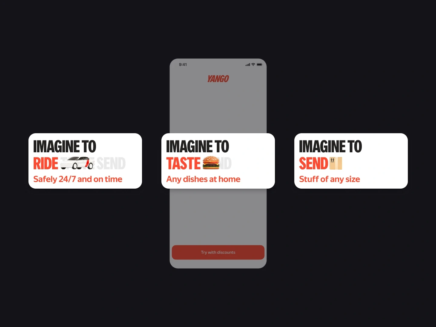
In collaboration with another designer, we designed a new splash and welcome screen that adds a sense of locality and brand presence right from the start. It not only describes the app but also provides a bright first impression of the product.
Together, these improvements contribute to a more modern, solid, and context-aware onboarding experience that go beyond of the expectations of today's users.
The results confirmed the effectiveness of the approach — conversion to registration increased by 15%, demonstrating the value of thoughtful design solutions grounded in users needs.
MORE PROJECTS

